Common items
Common items
Shadows in app
In order to configure the shadows in the app, add the following code.
1 2 | |
Widget background 1
In order to configure the widget background with rounded corners, add the following code.
1 2 | |
Widget background 2
In order to configure the background for the widget's header, add the following code.
1 2 | |
Widget background - shape
In order to configure the shape of the background, add the following code.
1 2 | |
Widget dialog background
In order to configure the dialog background, add the following code.
1 | |
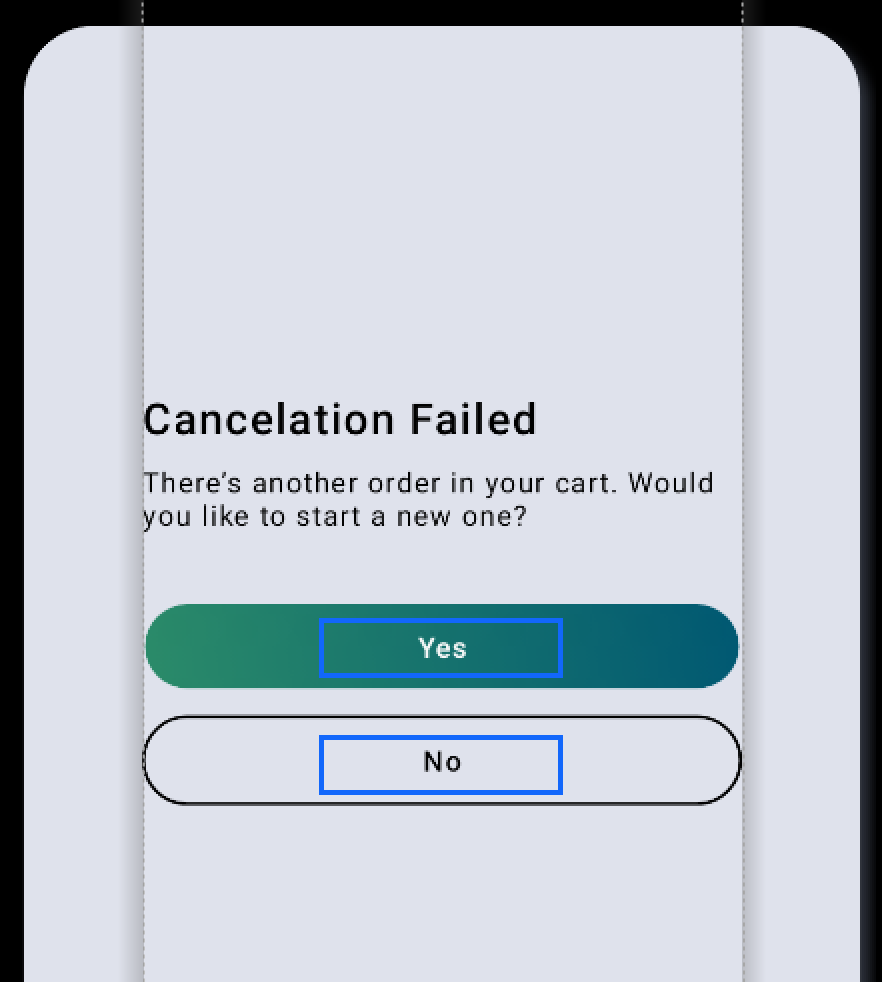
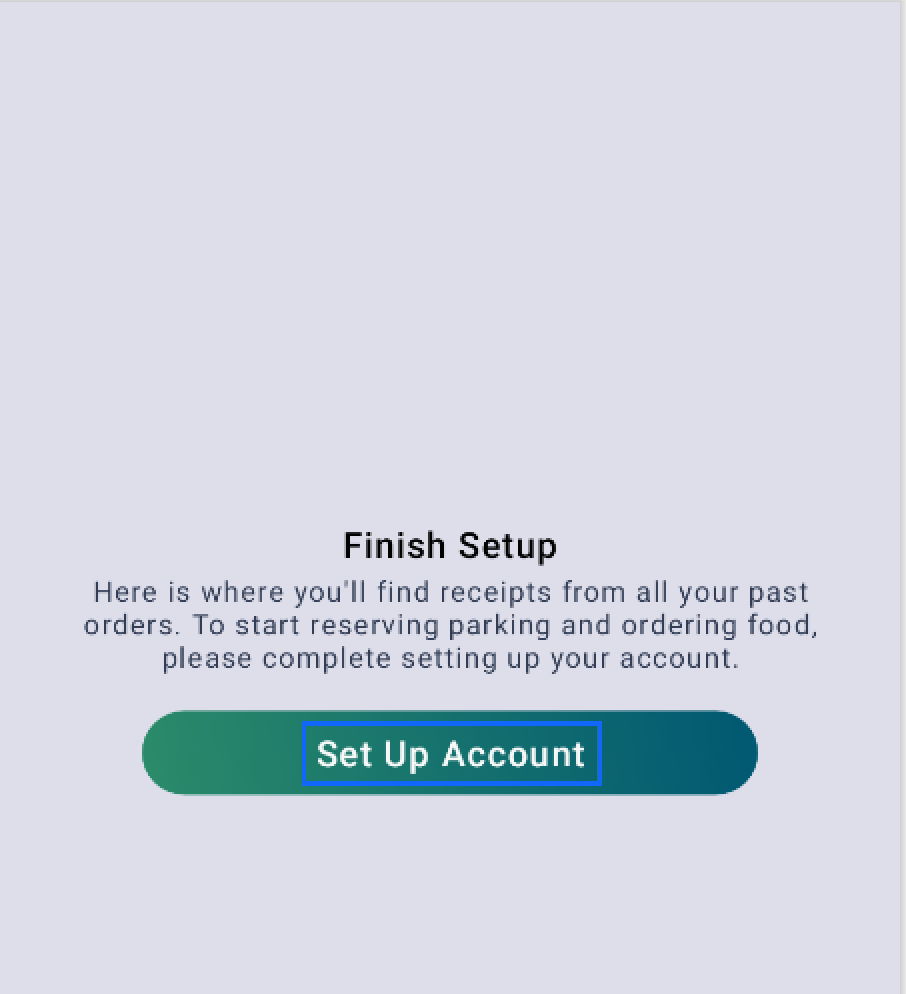
Buttons
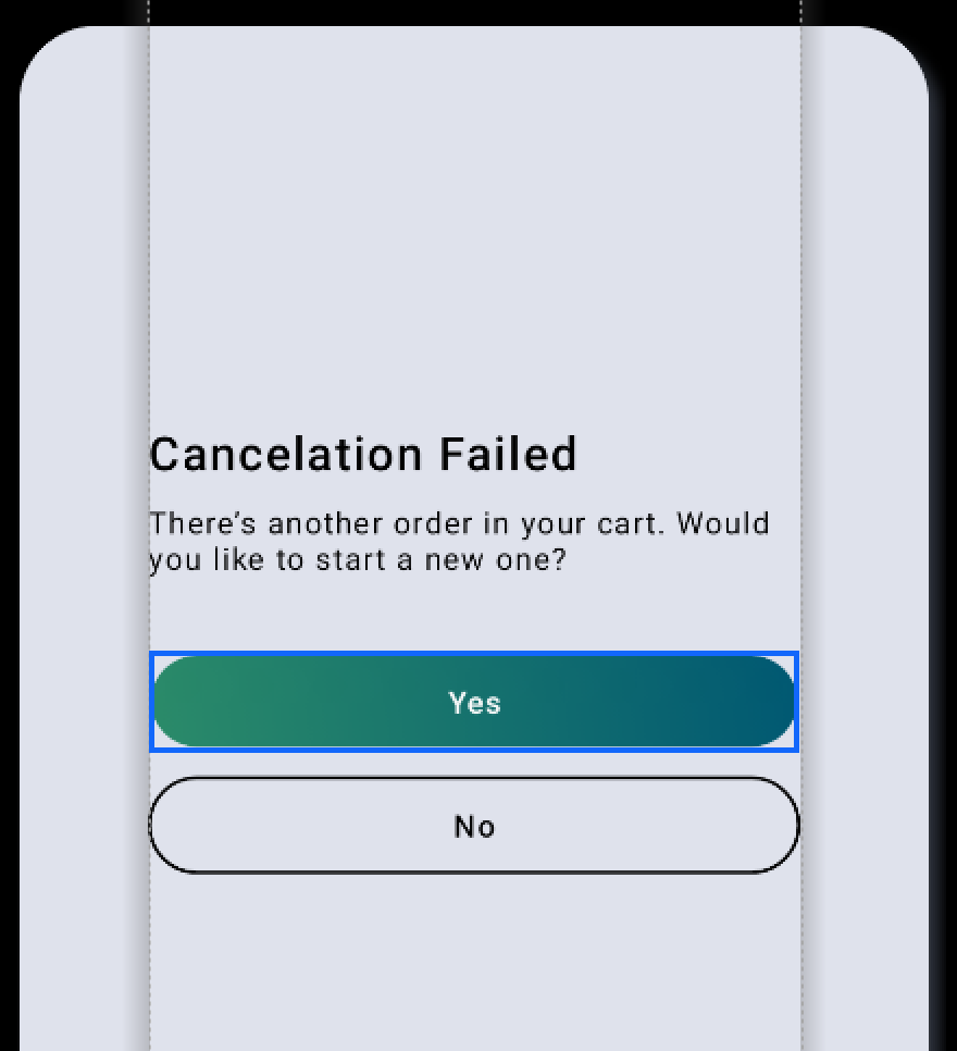
Positive buttons
In order to configure the positive buttons, add the following code.
Info
This attribute refers to all the action buttons (the green colored buttons) from the widgets app.
1 | |
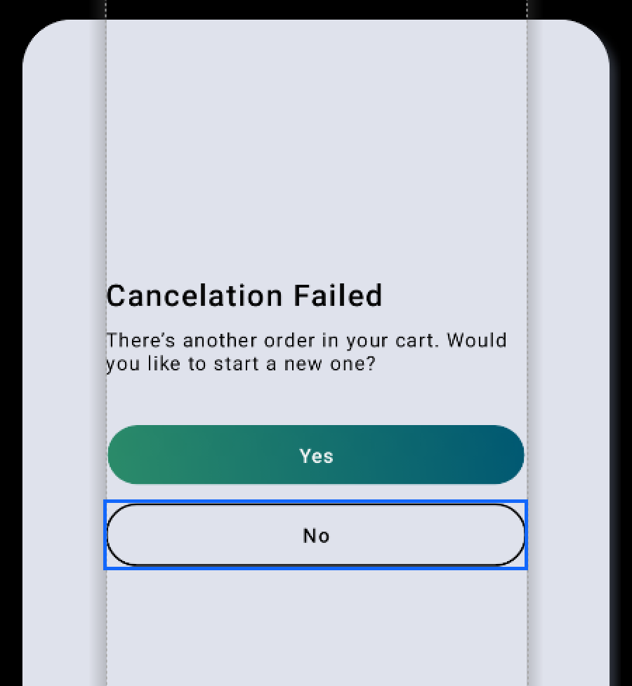
Negative buttons
In order to configure the negative buttons, add the following code.
Info
This attribute refers to all the negative action buttons (No, Cancel) from the widgets app.
1 | |
Brand name
In order to configure the brand name, add the following code.
1 2 3 | |
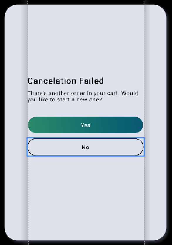
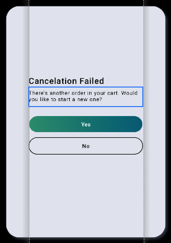
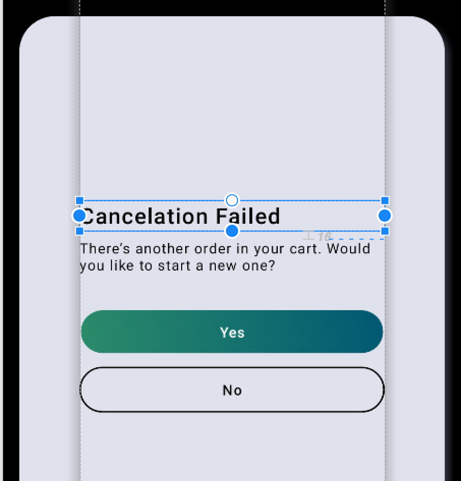
Cancel dialog/Discard flow text
Cancel dialog
In order to configure the cancel dialog, add the following code.
1 2 | |

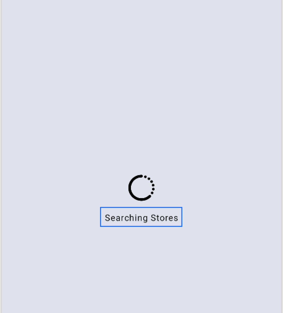
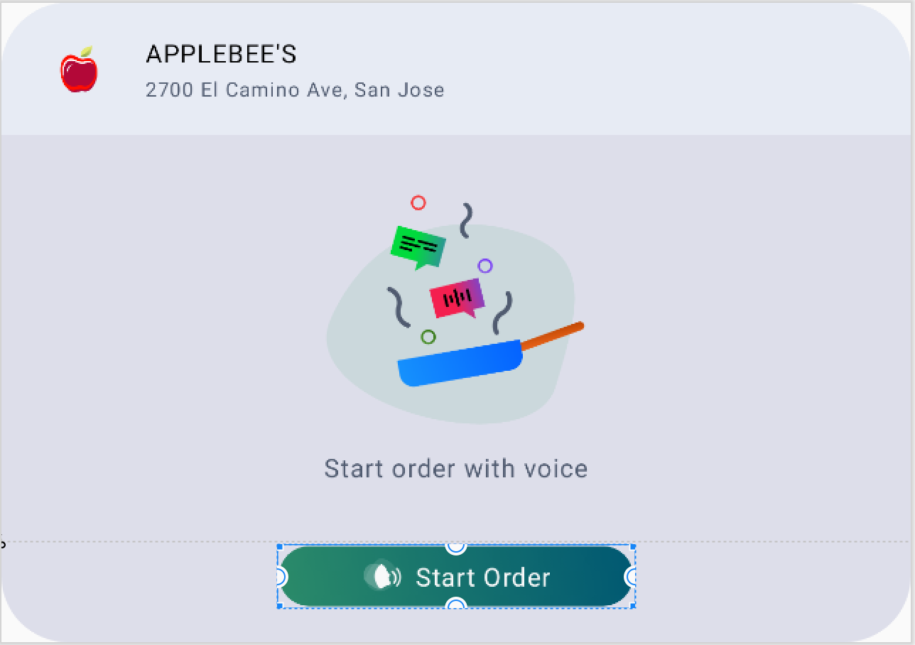
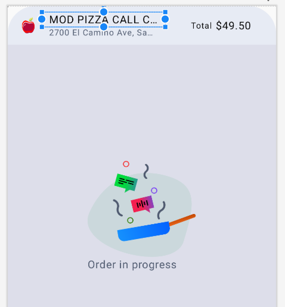
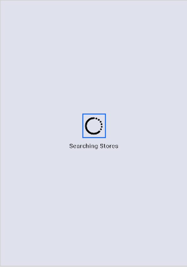
Loading indicator
In order to configure the loading indicator, add the following code.
1 | |
Widget dialog text primary color
In order to configure the primary color of the dialog text, add the following code.
Info
The "icc_widget_cancel_dialog_text_primary_color" is the color of the descriptive text, highlighted below, for the cases when the dialog doesn't have a title.
1 | |
Widget dialog text secondary color
In order to configure the secondary color of the dialog text, add the following code.
Info
The "icc_widget_cancel_dialog_text_secondary_color" is the color of the descriptive text, highlighted above, for the cases when the dialog has a title.
1 | |
Widget dialog title
In order to configure the dialog title, add the following code.
1 2 3 | |
Cancel dialog/Discard flow buttons
Dialog buttons
In order to configure the dialog buttons, add the following code.
1 2 | |
Dialog positive button
In order to configure the dialog positive buttons, add the following code.
1 | |
Dialog negative button
In order to configure the dialog negative buttons, add the following code.
1 | |
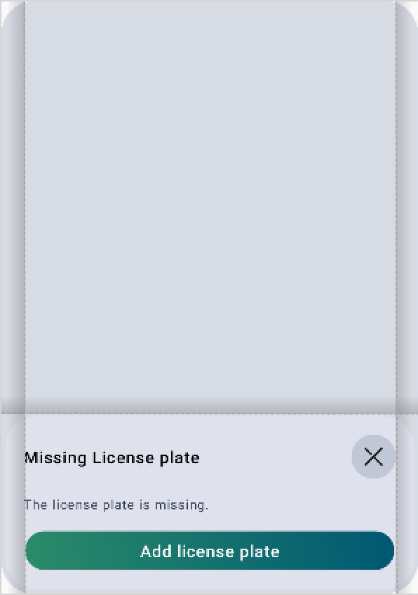
Missing data dialog
Missing data dialog title
In order to configure the data dialog title, add the following code.
1 2 3 | |
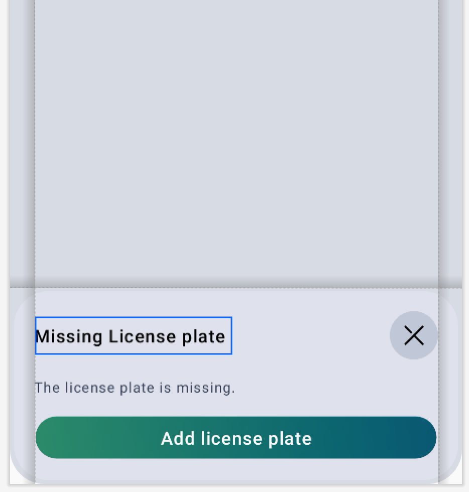
Missing data dialog description
In order to configure the missing data dialog, add the following code.
1 2 3 | |
Missing data dialog text button
In order to configure the missing data dialog button, add the following code.
1 2 3 | |
Left padding of the widget
In order to configure the left padding customization, add the following code.
1 | |